Sunday, November 04, 2007

Japanese Woodblock Prints

Here's a nice flickr set: Japanese prints (Mando Maniac)
This one is a cover by Uemura Shoen . I love the colors. I am using that green in my new painting. (Thanks, Internet Weekly for the art link)
I have been painting non-stop for days now and have not had time to attend to my blog. It looks like I lost some subscribers and I hope you will all come back.Tomorrow is my final day of work on my new painting for the Green Show. I've been painting a couple of months on this one and I will be glad to be done. Then I can get back to blogging and preparing for my trip to Santa Monica and finishing the "Honeybee" painting.

Thursday, November 01, 2007

Where Have I Been?

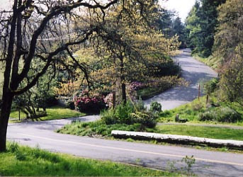
This is one of the roads where I take my daily hike. Since I have been painting 12 or 13 hour days, I have had to squeeze my little hike in just before dark. Emails are piling up and everything else is a mess. My little "Honeybee" painting is still not finished, so I can't show it to you yet. I had to put it aside to concentrate on a large painting that I am doing for the Green Show in Santa Monica, CA (opening November 17). The theme of the Green Show is nature and it will be very interesting to see the different interpretations. I'm sure it will be a show to remember. That reminds me, I need to reserve my plane tickets.

Monday, October 29, 2007

Vintage Sheet Music Covers, University of Colorado Library


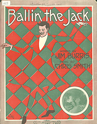
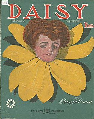
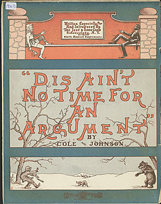
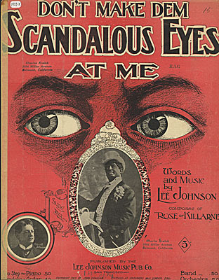
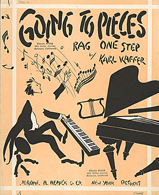
I have a tendency to use blues or rag song titles for the titles of my paintings. Most often I just make them up, but sometimes I am inspired by the real thing. There is a large collection of vintage sheet music covers in the University of Colorado digital library. They are appealing not only for the poetic quality of the song titles, but for the design quality of the artwork and hand-lettering as well. Here, I have shown a selection from 1903-1915.

Saturday, October 27, 2007

Mark Murphy's GREEN Show - Happening in November

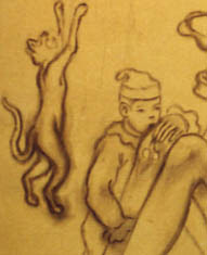
Small detail of sketch on canvas for Amy Crehore's Green Show painting
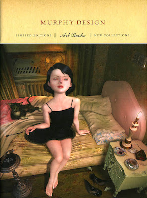
Promotion booklet for Mark Murphy's Art Books (image copyright Ray Caesar)
I am currently working on a large painting for the GREEN Show opening November 17th, 2007 at the Robert Berman Gallery (7pm-10pm) C2 Gallery Space, Bergamot Station, Santa Monica, CA. Here, I am showing you just a small piece of the larger image- sketched on canvas before I started adding color. I want this one to be a surprise, so I won't be unveiling it until the week of the show.
The GREEN Show is curated by Mark Murphy, a designer who publishes wonderful art books and calendars. Here is the cover of his promotional booklet featuring a fantastic painting by Ray Caesar, whose book is now available for pre-order at the Murphy Design site along with some other favorite artists.
Featured Artists in the GREEN Show: Jason D Aquino + Jordan Awan + Andrew Brandou + Cathie Bleck+ Marc Burckhardt + William Buzzell + Luke Chueh + David Chung + Amy Crehore +Kevin Christy + Sas Christian + John Copeland + Bob Dob + andrew foster+ Douglas Fraser + P-Jay Fidler + Joseph Daniel Fiedler + AJ Fosik + RobertHardgrove + Jody Hewgill + Michael Hussar + Tim Hussey + Jordin Isip + Rich Jacobs + Pamela Jaeger + james jean + David Choong Lee + Anthony Lister +Jen Lobo + Mars-1 + Chris Mostyn + Mark Murphy + Scott Musgrove + Christian Northeast + Martha Rich and Esther Pearl Watson Collaboration + Kathie Olivas + Nathan Ota + Brandt Peters + Jermaine Rogers + Kim Scott + Keith Shore + Jeff Soto + Damon Soule + Matt Stallings + Gary Taxali + Amanda Wachab + Justin Wood
Wow...what an incredible list. These paintings will all be fairly large works, each celebrating personal visions of nature. I will be flying down for the opening of this one.
P.S. Click on "Vote for me" if you like this blog.

Thursday, October 25, 2007

Vintage Pierrots from Barcelona

Look-y what my new friend Valerie sent me from Barcelona. A beautiful image of two young boys dressed in pierrot outfits. This vintage photo shows the different kinds of hats, large buttons and ruffled collars of typical "little pierrots" about 90 years ago.
Thanks, Valerie!

Wednesday, October 24, 2007

Step 6: Honing it in, Softening it up

"Honeybee"-blogging as the painting progresses - Amy Crehore 2007

I worked on softening the girl's skin by dabbing white, sometimes mixed with a bit of yellow or pink, over her entire body. This gave it a nicer effect and took away the harsh undertone. I did the same on the little guy. I am also adding darker paint to the shadow areas all around to make things pop out more, re-drawing when I think something is not quite right. I painted some details on the ukulele. Everything will get stronger and more intense as I keep adding paint. Highlights and shadows. Details. If I overwork something, I wipe it off and restore it to the way it was and try again. I use odorless turpenoid as a thinner mainly to clean my brushes with or to wipe things off. I rarely ever use thinner to thin the paint. After I'm done painting for the day, I clean my brushes with thinner and then soap and water. Then, I dip the sables in olive oil to make them last longer.
This is a small painting, almost a miniature. I have been working on a large canvas at the same time and, I have to say, sometimes it's way easier to work larger. Working small can get anal.
I think this will be my last post before I show you the final. Scanning the steps and showing you how it's done is limited because I have to wait for things to dry. Sometimes working on an oil painting is all about leaving certain things wet for a while. The beauty of oil paint is that I can blend things while the paint is still wet. I still have a few more days of work on "Honeybee".

Tuesday, October 23, 2007

Step 5: Painting the Skin

Adding color to the skin-tone for "Honeybee" by Amy Crehore
Here, I took some sap green and mixed it with cadmium red light on my palette. I brushed it into the shadow areas on the girl's skin as well as on the little guy's. Then, I let it sit for a while and dry a bit. Later, I went back in with my white paint, mixed with a bit of yellow, and dabbed that color into the highlight areas. I used a small brush (sable) and began to dab and blend the whole thing (wet on wet). She's looking a bit too tan and I will probably be going back to add a white glaze to her skin-tone. But, the main thing is, I am building up paint layers toward a rich finish. I want the main figures to be more defined and the things in the background to be less so.

About 3-4 years ago, I began to draw strictly from my imagination. Before that, I created paintings for many years by piecing together ideas and images using reference materials. My new drawings were very crude at first, but I practiced everyday. Now I just use my memory and feel things out. My most important tool is my eraser! It's my own made-up language of characters and icons interacting in a made-up world. Don't ask what it all means. It's visual. I never think about "style" or what's "in". I just try to be myself. It comes from the heart. Once in a while, I will get stumped and need to look up a picture of something or look in the mirror to see how a pose might go, but mainly it's more about the design of a picture. How the whole thing fits together. A story evolves out of the design when I draw. The pose of the main figure is all about angles, shapes and such. The girl's hands and feet are usually connected to the other figures somehow. Unity. Connections. Echoing patterns in a mysterious world. Creating entertainment for you and me.