Sunday, October 21, 2007

Part 4: Adding color/layers to "Honeybee"

Adding another color to "Honeybee" by Amy Crehore
I decided that I wanted to add more color and elements to the composition, so I took my cadmium red light and made some red accents. I put some pink flowers in and added some dots on the tent, to echo the shape of the banjo ukulele. As I go along, I am also adding more layers of paint to everything. The only way to end up with a really rich effect in the final version is to keep on adding paint.
I use a dozen or so brushes at a time, all different - red sables and bristle brushes- all sizes and shapes. I can load different paint colors on them and not worry about cleaning them until the end of a session. My extra fine Holbein oil paints are really smooth like butter and Winsor & Newton Liquin is my medium of choice.
These paintings don't all go smoothly and I may have difficulty on certain areas. Often, I make up things as I go along. If I want to change a color, I will just paint over it or I may even sand it down and try again, like on a face.
Scanning the different steps is actually helping me out - I've never done this before. It's easy to "lose" what's underneath sometimes and, this way, I can go back and check my initial painted sketch.

Friday, October 19, 2007

Step 3: Blocking in Color for "Honeybee"

First color round for "Honeybee" by Amy Crehore 2007
Here is my first attempt at color for my "Honeybee" painting. I usually try to block in the background first. The green grass and tent. Then, I move on to the figures, keeping in mind that I want to set up a pattern of harmonious color moving throughout the whole painting to connect all of the components. Here, I have chosen a limited palette of sap green mixed with indian yellow, plus some olive green, raw umber, white and cobalt blue. I painted the shadow areas of the girl with a mixture of cadmium red light and sap green. I used white paint (Permalba) mixed with indian yellow for her skin highlights and then blended it to produce the color that you see here. I am painting "wet on wet".
I may decide to add more color to the composition, perhaps an accent of red. I wanted to coat the surface with an initial layer of paint first, but everything will ultimately have many more layers before the painting is fully realized. I have not worked on this surface before, I usually use an oil-primed linen, but I am trying something new. It is an acrylic-primed cradled board from Dick Blick. It seems to be working out fine. I am also adding "liquin" to my paint for speedier drying. I don't add anything else. Check back to see my progress in the days to come.

Wednesday, October 17, 2007

"Honeybee" Sketch by Amy Crehore- Parts 1 and 2

Step one: "Honeybee" sketch by Amy Crehore copyright 2007
Step two: "Honeybee" sketch transferred and re-drawn onto gessoed board
I thought that you might like to see the process I use to create an oil painting. This is a small 8" square piece that I am working on for Miami Basel. I began with a detailed pencil sketch. I drew this from my head and erased a lot until I became satisfied with the design and composition. I then took my cradled board and rubbed a layer of raw sienna paint onto the surface with a rag. I xeroxed my sketch and rubbed pencil onto the back of the xerox. After the paint dried, I layed the drawing onto the gessoed board and re-drew the lines to make a transfer. With raw umber paint, I re-drew it once again with a paint brush.
This image is a combination of characters from all of my series works. The girl appears different in the pencil sketch than she does in the painted sketch. And she will change yet again as I begin to add color. I never know exactly how it will turn out. With oil paint I can change colors and paint over mistakes easily. I may even add things to the composition. Stay tuned.

Tuesday, October 16, 2007

Ancient Comics Delight Us Still


First two panels from "The Naps of Polly Sleepyhead"

Peter Newell, author/illustrator of the "Slant Book" (1910), one of my all-time favorite children's books, apparently also created a surreal comic strip in 1906-1907 called "The Naps of Polly Sleepyhead". Like "Little Nemo in Slumberland" it draws us into the wacky dreamworld of a girl named Polly. This strange little girl drifts off to sleep in the middle of doing the most commonplace activities. Here is an excerpt from the first strip where her cat named Spider turns into a scary hybrid cat-spider, weaving her ball of yarn into a big spider web. The second strip has Polly sitting down with a big plate of ice cream, but deciding instead to use it as a hat (!) for her doggy and proceed to take him for a (sleep)walk outside where the hat melts. She then wakes up in a puddly mess. Read more about Polly and other classic and obscure ancient comics at this fascinating website:
Barnacle Press
Thanks to STWALLSKULL (fez lovers) for the GREAT link!
The Art of Amy Crehore

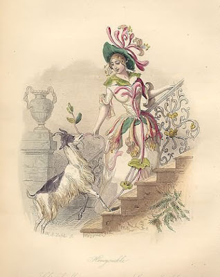
Antique Prints of Flower-women

Thistle
Cornflower and Poppy
Honeysuckle
Marvel of Peru
Prints by J. J. Grandville. From Les Fleurs Animées. Paris: Garnier Freres, [1867]. Octavo: images are ca. 7 x 5 1/2 inches. Steel engravings by Ch. Geoffroy. Original hand-coloring.
"A series of delightful prints illustrating flowers personified in the form of lovely maidens and their animal retinues. Each early 19th-century female figure is richly costumed in the leaves, blossoms and garlands that designate her flower." You can look at or buy these prints at the Philadelphia Print Shop. They also have lots of other inspiring antique prints including American Indian portraits.


Monday, October 15, 2007

What am I working on?

Detail of illustration by Amy Crehore 2007
Here is a small detail of a larger illustration that I just finished for a NYC-based magazine. It doesn't come out until January. I am also working on a large painting for a show in November at Robert Berman Gallery, Bergamot Station, Santa Monica, CA. I just ordered a special frame for it and I'm really excited. This frame will definitely enhance the painting. I am also doing a small piece for Miami Basel. Mark Murphy is the curator for both shows. I will soon be listing all of the other wonderful artists that he has asked to participate in these exhibitions. You might want to check out Mark's website. He has some very interesting art books available!
Also, luthier Lou Reimuller is 3/4 done with the second "Tickler" ukulele which I shall paint as soon as he hands it over to me. This ukulele is a very different shape and style than the first one. It will have a "mother of toilet seat" fingerboard and a uniquely designed headstock. And, last but not least, I am figuring out the artwork for the "Tickler" t-shirt that I blogged about earlier and I hope to have them available in the next month or so on my website. My old pal in Richmond, VA is helping me out. I worked at a t-shirt company for a couple of years when I was quite young.

Saturday, October 13, 2007

Mediocrity is the Number One Killer

Don't settle for mediocrity in art.
Andy Warhol said in an interview once, "I just did the easiest thing I could think of". And the public bought into it anyway, didn't they?
Here are some quotes about MEDIOCRITY .
The first one goes like this:
"All good is hard. All evil is easy. Dying, losing, cheating, and mediocrity is easy. Stay away from easy."- Scott Alexander