Monday, September 24, 2007

Worth 1000 eye teasers

From the Monster contest
From the Them There Eyes contest
From the Celebrity Puppet contest
I'm sure most of you know about Worth 1000, but I did not. That is, until someone showed me an assortment of vegetables miraculously turned into beautiful animals. Above are just some of the surrealistic creations from that wacky site's photoshop contests. Crazy man. And creative, too.
WORTH 1000

The Art of Amy Crehore

Saturday, September 22, 2007

Early Little Pierrots

Painting #3 by Amy Crehore
Painting #5 by Amy Crehore
Painting #6 by Amy Crehore
Painting #7 by Amy Crehore
Painting#8 by Amy Crehore
I don't even have some of my earliest "Little Pierrots" on my website. Here are a few from March 2004 and they only have numbers as titles. They are more sketchy than my later ones. Some I can't even show you (there are some that take place in a forest). I painted one per day (fast for me) and I sent them to an illustrator friend. It was an experiment and an exercise. They were drawn from my head using no references. It began with a painting of a cat sitting on a guitar boat in the ocean looking through binoculars at a naked girl on the beach. That is how I came up with the circular format... this was supposed to be what the cat saw. He saw a girl and a pierrot. Somehow they all ended up performing on stage. Later on, I spent up to a week on each one and they got more complicated and refined:

Friday, September 21, 2007

Mother Lode of Victorian Trade Card Art


I just came across an incredible resource for artists or anyone who loves Victorian illustration, humorous advertising and the color lithography of the late 1800's. I have shown only a few examples of Victorian Trade Cards here. Follow this link to an online reference library of an amazing amount of unique and exciting images:
Click on all of the links, you can't go wrong! A feast for your eyes.
Here's a brief intro to Victorian Trade Cards: "Over a century ago, during the Victorian era, one of the favorite pastimes was collecting small, illustrated advertising cards that we now call trade cards...Some of the products most heavily advertised by trade cards were in the categories of: medicine, food, tobacco, clothing, household, sewing, stoves, and farm. The popularity of trade cards peaked around 1890, and then almost completely faded by the early 1900s when other forms of advertising in color, such as magazines, became more cost effective." from article by Ben Crane

The Art of Amy Crehore

Thursday, September 20, 2007

Look and Learn!


Click on images to enlarge
It is stamped "Property of Blackwell Jr. High", but it looks like a textbook for a 2nd grader. It's my "Look and Learn" book by Scott, Foresman and Company from 1949 that I picked up at a flea market so long ago that I can't remember where or when. It's my single most used reference book next to my Golden Nature Guides. And it's surreal. No real words, just some very strange and exciting pictures. I love the style of it, yet it was painted by nine different people. It's torn and beat up and dirty. I wouldn't have it any other way and I can't do without it sometimes.
The Art of Amy Crehore

myspace: been there, done that

I'm cancelling my myspace account. Anyone who was my friend at myspace who would like to be on my emailing list please contact me here: amy@amycrehore.com
Or anyone else, for that matter, who would like to get my news updates via email.
I gave myspace a good ol' try since last February, but I am much happier spending my time writing this blog.
The Art of Amy Crehore
Wednesday, September 19, 2007

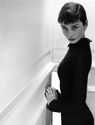
Audrey Style


Photo by Unknown 1954
Photo by Anthony Beauchamp 1950

It's hard to say when Audrey Hepburn "peaked".
She had some perky peaks and pointed peaks. This gal was all about style. Whether it was starring in a film or doing charity work for Unicef, Audrey could do no wrong. She had class, humor and strong values. Too bad her life was so short. I'm sure she would have accomplished even more and grown even more beautiful as the years went by. This is my little tribute to that rare gem with the unforgettable eyebrows and photogenic face, a designer's dream girl:


Now, why can't we have more Audreys and Louise Brooks girls? I'm tired of hardcore tacky.

Tuesday, September 18, 2007

KAHN and SELESNICK


Click on Images to Enlarge
(photos copyright Kahn&Selesnick)
"Richard Selesnick and Nicholas Kahn have been collaborating as Kahn/Selesnick since 1988 on a series of complex narrative photo-novellas and sculptural installations.... they found that shooting a 360 degree panorama could create a truer, more cinematic sense of the place, while their manipulation of costume, props and period color would help them alter the sense of time. " -from their bio
They have a new great website that you will have to check out for yourself.
The lovely surrealistic creations of:
Kahn and Selesnick
The Art of Amy Crehore