Monday, October 29, 2007

Vintage Sheet Music Covers, University of Colorado Library


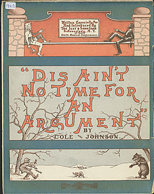
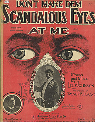
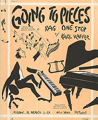
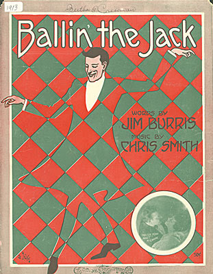
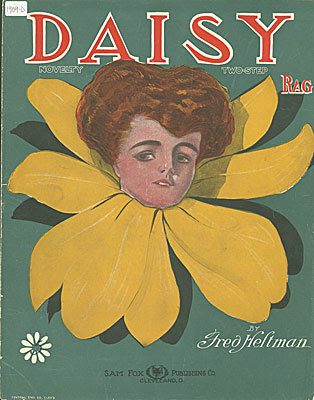
I have a tendency to use blues or rag song titles for the titles of my paintings. Most often I just make them up, but sometimes I am inspired by the real thing. There is a large collection of vintage sheet music covers in the University of Colorado digital library. They are appealing not only for the poetic quality of the song titles, but for the design quality of the artwork and hand-lettering as well. Here, I have shown a selection from 1903-1915.

Saturday, October 27, 2007

Mark Murphy's GREEN Show - Happening in November

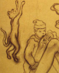
Small detail of sketch on canvas for Amy Crehore's Green Show painting
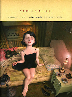
Promotion booklet for Mark Murphy's Art Books (image copyright Ray Caesar)
I am currently working on a large painting for the GREEN Show opening November 17th, 2007 at the Robert Berman Gallery (7pm-10pm) C2 Gallery Space, Bergamot Station, Santa Monica, CA. Here, I am showing you just a small piece of the larger image- sketched on canvas before I started adding color. I want this one to be a surprise, so I won't be unveiling it until the week of the show.
The GREEN Show is curated by Mark Murphy, a designer who publishes wonderful art books and calendars. Here is the cover of his promotional booklet featuring a fantastic painting by Ray Caesar, whose book is now available for pre-order at the Murphy Design site along with some other favorite artists.
Featured Artists in the GREEN Show: Jason D Aquino + Jordan Awan + Andrew Brandou + Cathie Bleck+ Marc Burckhardt + William Buzzell + Luke Chueh + David Chung + Amy Crehore +Kevin Christy + Sas Christian + John Copeland + Bob Dob + andrew foster+ Douglas Fraser + P-Jay Fidler + Joseph Daniel Fiedler + AJ Fosik + RobertHardgrove + Jody Hewgill + Michael Hussar + Tim Hussey + Jordin Isip + Rich Jacobs + Pamela Jaeger + james jean + David Choong Lee + Anthony Lister +Jen Lobo + Mars-1 + Chris Mostyn + Mark Murphy + Scott Musgrove + Christian Northeast + Martha Rich and Esther Pearl Watson Collaboration + Kathie Olivas + Nathan Ota + Brandt Peters + Jermaine Rogers + Kim Scott + Keith Shore + Jeff Soto + Damon Soule + Matt Stallings + Gary Taxali + Amanda Wachab + Justin Wood
Wow...what an incredible list. These paintings will all be fairly large works, each celebrating personal visions of nature. I will be flying down for the opening of this one.
P.S. Click on "Vote for me" if you like this blog.

Thursday, October 25, 2007

Vintage Pierrots from Barcelona

Look-y what my new friend Valerie sent me from Barcelona. A beautiful image of two young boys dressed in pierrot outfits. This vintage photo shows the different kinds of hats, large buttons and ruffled collars of typical "little pierrots" about 90 years ago.
Thanks, Valerie!

Wednesday, October 24, 2007

Step 6: Honing it in, Softening it up

"Honeybee"-blogging as the painting progresses - Amy Crehore 2007

I worked on softening the girl's skin by dabbing white, sometimes mixed with a bit of yellow or pink, over her entire body. This gave it a nicer effect and took away the harsh undertone. I did the same on the little guy. I am also adding darker paint to the shadow areas all around to make things pop out more, re-drawing when I think something is not quite right. I painted some details on the ukulele. Everything will get stronger and more intense as I keep adding paint. Highlights and shadows. Details. If I overwork something, I wipe it off and restore it to the way it was and try again. I use odorless turpenoid as a thinner mainly to clean my brushes with or to wipe things off. I rarely ever use thinner to thin the paint. After I'm done painting for the day, I clean my brushes with thinner and then soap and water. Then, I dip the sables in olive oil to make them last longer.
This is a small painting, almost a miniature. I have been working on a large canvas at the same time and, I have to say, sometimes it's way easier to work larger. Working small can get anal.
I think this will be my last post before I show you the final. Scanning the steps and showing you how it's done is limited because I have to wait for things to dry. Sometimes working on an oil painting is all about leaving certain things wet for a while. The beauty of oil paint is that I can blend things while the paint is still wet. I still have a few more days of work on "Honeybee".

Tuesday, October 23, 2007

Step 5: Painting the Skin

Adding color to the skin-tone for "Honeybee" by Amy Crehore
Here, I took some sap green and mixed it with cadmium red light on my palette. I brushed it into the shadow areas on the girl's skin as well as on the little guy's. Then, I let it sit for a while and dry a bit. Later, I went back in with my white paint, mixed with a bit of yellow, and dabbed that color into the highlight areas. I used a small brush (sable) and began to dab and blend the whole thing (wet on wet). She's looking a bit too tan and I will probably be going back to add a white glaze to her skin-tone. But, the main thing is, I am building up paint layers toward a rich finish. I want the main figures to be more defined and the things in the background to be less so.

About 3-4 years ago, I began to draw strictly from my imagination. Before that, I created paintings for many years by piecing together ideas and images using reference materials. My new drawings were very crude at first, but I practiced everyday. Now I just use my memory and feel things out. My most important tool is my eraser! It's my own made-up language of characters and icons interacting in a made-up world. Don't ask what it all means. It's visual. I never think about "style" or what's "in". I just try to be myself. It comes from the heart. Once in a while, I will get stumped and need to look up a picture of something or look in the mirror to see how a pose might go, but mainly it's more about the design of a picture. How the whole thing fits together. A story evolves out of the design when I draw. The pose of the main figure is all about angles, shapes and such. The girl's hands and feet are usually connected to the other figures somehow. Unity. Connections. Echoing patterns in a mysterious world. Creating entertainment for you and me.

Sunday, October 21, 2007

Part 4: Adding color/layers to "Honeybee"

Adding another color to "Honeybee" by Amy Crehore
I decided that I wanted to add more color and elements to the composition, so I took my cadmium red light and made some red accents. I put some pink flowers in and added some dots on the tent, to echo the shape of the banjo ukulele. As I go along, I am also adding more layers of paint to everything. The only way to end up with a really rich effect in the final version is to keep on adding paint.
I use a dozen or so brushes at a time, all different - red sables and bristle brushes- all sizes and shapes. I can load different paint colors on them and not worry about cleaning them until the end of a session. My extra fine Holbein oil paints are really smooth like butter and Winsor & Newton Liquin is my medium of choice.
These paintings don't all go smoothly and I may have difficulty on certain areas. Often, I make up things as I go along. If I want to change a color, I will just paint over it or I may even sand it down and try again, like on a face.
Scanning the different steps is actually helping me out - I've never done this before. It's easy to "lose" what's underneath sometimes and, this way, I can go back and check my initial painted sketch.
Friday, October 19, 2007

Step 3: Blocking in Color for "Honeybee"

First color round for "Honeybee" by Amy Crehore 2007
Here is my first attempt at color for my "Honeybee" painting. I usually try to block in the background first. The green grass and tent. Then, I move on to the figures, keeping in mind that I want to set up a pattern of harmonious color moving throughout the whole painting to connect all of the components. Here, I have chosen a limited palette of sap green mixed with indian yellow, plus some olive green, raw umber, white and cobalt blue. I painted the shadow areas of the girl with a mixture of cadmium red light and sap green. I used white paint (Permalba) mixed with indian yellow for her skin highlights and then blended it to produce the color that you see here. I am painting "wet on wet".
I may decide to add more color to the composition, perhaps an accent of red. I wanted to coat the surface with an initial layer of paint first, but everything will ultimately have many more layers before the painting is fully realized. I have not worked on this surface before, I usually use an oil-primed linen, but I am trying something new. It is an acrylic-primed cradled board from Dick Blick. It seems to be working out fine. I am also adding "liquin" to my paint for speedier drying. I don't add anything else. Check back to see my progress in the days to come.

Wednesday, October 17, 2007

"Honeybee" Sketch by Amy Crehore- Parts 1 and 2

Step one: "Honeybee" sketch by Amy Crehore copyright 2007
Step two: "Honeybee" sketch transferred and re-drawn onto gessoed board
I thought that you might like to see the process I use to create an oil painting. This is a small 8" square piece that I am working on for Miami Basel. I began with a detailed pencil sketch. I drew this from my head and erased a lot until I became satisfied with the design and composition. I then took my cradled board and rubbed a layer of raw sienna paint onto the surface with a rag. I xeroxed my sketch and rubbed pencil onto the back of the xerox. After the paint dried, I layed the drawing onto the gessoed board and re-drew the lines to make a transfer. With raw umber paint, I re-drew it once again with a paint brush.
This image is a combination of characters from all of my series works. The girl appears different in the pencil sketch than she does in the painted sketch. And she will change yet again as I begin to add color. I never know exactly how it will turn out. With oil paint I can change colors and paint over mistakes easily. I may even add things to the composition. Stay tuned.

Tuesday, October 16, 2007

Ancient Comics Delight Us Still


First two panels from "The Naps of Polly Sleepyhead"

Peter Newell, author/illustrator of the "Slant Book" (1910), one of my all-time favorite children's books, apparently also created a surreal comic strip in 1906-1907 called "The Naps of Polly Sleepyhead". Like "Little Nemo in Slumberland" it draws us into the wacky dreamworld of a girl named Polly. This strange little girl drifts off to sleep in the middle of doing the most commonplace activities. Here is an excerpt from the first strip where her cat named Spider turns into a scary hybrid cat-spider, weaving her ball of yarn into a big spider web. The second strip has Polly sitting down with a big plate of ice cream, but deciding instead to use it as a hat (!) for her doggy and proceed to take him for a (sleep)walk outside where the hat melts. She then wakes up in a puddly mess. Read more about Polly and other classic and obscure ancient comics at this fascinating website:
Barnacle Press
Thanks to STWALLSKULL (fez lovers) for the GREAT link!
The Art of Amy Crehore

Antique Prints of Flower-women

Thistle
Cornflower and Poppy
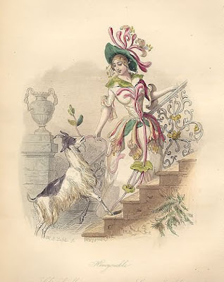
Honeysuckle
Marvel of Peru
Prints by J. J. Grandville. From Les Fleurs Animées. Paris: Garnier Freres, [1867]. Octavo: images are ca. 7 x 5 1/2 inches. Steel engravings by Ch. Geoffroy. Original hand-coloring.
"A series of delightful prints illustrating flowers personified in the form of lovely maidens and their animal retinues. Each early 19th-century female figure is richly costumed in the leaves, blossoms and garlands that designate her flower." You can look at or buy these prints at the Philadelphia Print Shop. They also have lots of other inspiring antique prints including American Indian portraits.


Monday, October 15, 2007

What am I working on?

Detail of illustration by Amy Crehore 2007
Here is a small detail of a larger illustration that I just finished for a NYC-based magazine. It doesn't come out until January. I am also working on a large painting for a show in November at Robert Berman Gallery, Bergamot Station, Santa Monica, CA. I just ordered a special frame for it and I'm really excited. This frame will definitely enhance the painting. I am also doing a small piece for Miami Basel. Mark Murphy is the curator for both shows. I will soon be listing all of the other wonderful artists that he has asked to participate in these exhibitions. You might want to check out Mark's website. He has some very interesting art books available!
Also, luthier Lou Reimuller is 3/4 done with the second "Tickler" ukulele which I shall paint as soon as he hands it over to me. This ukulele is a very different shape and style than the first one. It will have a "mother of toilet seat" fingerboard and a uniquely designed headstock. And, last but not least, I am figuring out the artwork for the "Tickler" t-shirt that I blogged about earlier and I hope to have them available in the next month or so on my website. My old pal in Richmond, VA is helping me out. I worked at a t-shirt company for a couple of years when I was quite young.

Saturday, October 13, 2007

Mediocrity is the Number One Killer

Don't settle for mediocrity in art.
Andy Warhol said in an interview once, "I just did the easiest thing I could think of". And the public bought into it anyway, didn't they?
Here are some quotes about MEDIOCRITY .
The first one goes like this:
"All good is hard. All evil is easy. Dying, losing, cheating, and mediocrity is easy. Stay away from easy."- Scott Alexander

Thursday, October 11, 2007

Little Pink Woopie

I got this off boingboing today. What can I say? It's hokum and surrealism bundled together in one cute little package, folks. You want more? There's more.

"Bergman Enjoyed the Process"

Ingmar Bergman
Woody Allen
I have not been keeping up with things in the news for the past couple of years and I'm behind on everything that I used to enjoy so much, like movies and things. I'm too wrapped up in my own work. But, I happened across this NY Times article yesterday.It is lovingly written by Woody Allen about his great friend and inspiration, Ingmar Bergman, who died July 31, 2007. There are some very interesting things in it. Woody writes:
"I did manage to absorb one thing from him, a thing not dependent on genius or even talent but something that can actually be learned and developed. I am talking about what is often very loosely called a work ethic but is really plain discipline. I learned from his example to try to turn out the best work I’m capable of at that given moment, never giving in to the foolish world of hits and flops or succumbing to playing the glitzy role of the film director, but making a movie and moving on to the next one."
Making art or films is not all about ego, money, or parading around for attention. For some, it's about the actual creative process: challenging oneself and turning out good work, a striving for quality and moving on to the next. Read the rest:
The Man Who Asked Hard Questions
The Art of Amy Crehore

Tuesday, October 09, 2007

The Nude Over the Bar

A Bar Nude from the Grand Imperial Hotel in Silverton, Colorado
I don't hang out in bars, but this gal does...every single night. Do her arms ever get tired of being in that position? I have to wonder. Maybe she is too drunk to notice and maybe she doesn't notice all of the men staring at her from their bar stools.
The same men every night. Drooling.
Lord Have Mercy.

The Romantic Sexuality of Surrealism

Meret Oppenheim's Famous Teacup 1936Meret Oppenheim holding a furry teacup in a furry outfit 1967
Robert Hughes wrote an article for the Guardian last March (as a review of the surrealist show at the Victorian and Albert Museum) about the romantic sexuality of surrealism. He went on to talk about the creation of sculptural objects that had a significant influence on design and fashion. Of all the objects one remembers, it is Meret Oppenheim's furry teacup and here is how the story went:
"The most famous of Oppenheim's works was Object, 1936, which grew out of an accessory design she had done for that principal patron of surrealist "thing-making", Elsa Schiaparelli. For the brilliant couturier, Oppenheim had done a gold metal bracelet covered (on the outside) with beaver fur. She wore it to meet Picasso for drinks at the Café de Flore, and Picasso remarked that if you could have a fur bracelet then practically anything else could also be covered with fur, and so transformed. Why not a coffee cup, for instance? So Oppenheim went right ahead, with cup, spoon and saucer, and the result was one of the few really sublime sexual images of the 20th century. It compels you to imagine raising this furry cup, wet with hot fluid, to your lips; it offers no possible meaning other than cunnilingus; it is exquisitely graceful and inescapably direct, both at once, and if ever a single work was enough for one artist's career, it is Oppenheim's cup."
Read more of this fascinating article by Robert Hughes here:
Meret Oppenheim Read about Meret,
one of Surrealism's many outstanding women artists and muses.

Monday, October 08, 2007

There Have Been Stranger Things

Double Bass Uke by Franz Walter AltpeterChris Knutsen’s family holding his harp ukuleles. Cute!
Gregg Miner wrote an interesting article about the history of a strange hybrid instrument called the Harp Ukulele. Gregg says, " Harp Ukulele – the name alone seems a contradiction in terms. Yet once upon a time in America, this unlikely hybrid (or perhaps 'variation' is a better word) was dreamt up and produced by not one, but two, unique individuals – separately and in completely different forms". The article goes on to tell us about Chris Knutsen's and Franz Walter Altpeter's original harp ukes and then we get to see some contemporary versions.

"Let Me Entertain You!"


Here are some choice images: French postcards I found on
The Casino de Paris dancers came from
Tallulahs
I love them all, don't you? The costumes are rad. And so is the guitar.

Dolls by Krisztina Egyed at Puppenstube Gallery


These dolls are by Krisztina Egyed from Canada. I like them - they are realistic, yet magical. Egyed captures barefoot young girls in pouty, thoughtful moods with messed-up hair and gauzy circus costumes, holding onto their adorable stuffed animals. I found them at the Puppenstube Gallery website -which has links to other artists as well:
The Art of Amy Crehore
If you like this blog please click on "vote for me". Thanks!

Hans Baldung Grien

"The Witches", Monochrome Print 1510 (Louvre)
Detail -"Mater Dolorosa" from Freiburg Cathedral 1516

Hans Baldung Grien 1529 "Music", Munich
"Hans Baldung was a German painter and graphic artist (1484-1545).
By 1503 Baldung had become a member of Albrecht Dürer's workshop. It was probably here that he acquired the nickname 'Grien', perhaps a reference to his use of the color green.
He was responsible for introducing supernatural and erotic themes into German art. He often depicted witches." His masterpiece was the multi-paneled high altar for the Freiburg Cathedral. He was wealthy when he died in Strasbourg in 1545. Link:
Hans Baldung Grien
I like this symbolic painting of music with the female nude, a cat and a violin.
The Art of Amy Crehore
If you like this blog, please click "Vote for me". Thanks!

Saturday, October 06, 2007

Sparkling Chapels Built of Trash, Glass and Obsidian

Howard Finster with his banjo
Howard Finster's Chapel at "Paradise Garden"
Rasmus Peterson's Rock Garden

Martin Sanchez's beer bottle chapel
It's time to visit Marlow Harris and JoDavid's blog, Unusual Life, for another glimpse of the good things in life - namely, the work of folk artist Martin Sanchez who built his own little oasis at his "Tio’s Tacos" restaurant on Mission Inn Avenue in Riverside, California.
UNUSUAL LIFE has plenty of pictures and descriptive copy about this wonderful place.
It reminds me of my other favorite folk artist, Howard Finster (link) who built "Paradise Garden" in Summerville, GA out of anything he could get his hands on. I saw him play the banjo back in 1985 or so at the University of Richmond. He was a painter, preacher and musician.
In Oregon, we have a place called Petersen's Rock Garden which is located out in the desert near Bend, OR. Rasmus Peterson quietly built his little heaven from 1935-1952 out of Oregon agates, obsidian, petrified wood, malachite and jasper. He was originally from Denmark. I love to take people there on day trips. When the sun shines, the place is magic.
I live for this kind of stuff! All of these artists are truly inspiring to me.
The Art of Amy Crehore

Herge and Tintin Unequaled

Herge with Andy Warhol in 1977. Photograph: Hergé-Moulinsart 2006
Tintin and Snowy
A post on boingboing about a Tintin movie reminded me of the original art and how much I love the clean graphic, surreal style of it. Herge's real name was Georges Remi and he was born in Brussels, Belgium in 1907 and died in 1983. He signed his drawings with Herge since he was 17 (reversing his initials to R.G. in French). Tintin and Snowy were first drawn in 1929 to appear in Le Petit Vingtieme, a children's supplement to a Belgian newspaper (which Georges Remi was chief editor of). The first Tintin book was published in 1930, "Tintin in the Land of the Soviets". The serialised strips were collected into 23 albums in all. The Pompidou Center in Paris had an exhibit devoted to Herge and his works this past year. Here's a picture of Herge and Andy Warhol in 1977 from the Guardian Unlimited blog article. You can tell that Andy is in awe of and humbled by the real "master" artist. It looks like Andy did a portrait of Herge (on the wall behind them). The article tells us at the end to "celebrate him"...yes, let's celebrate Herge's fabulous imagination and his thoroughly researched and amazing drawings.
Here is a fan site: Tintinologist
Official site:

Friday, October 05, 2007

Early Asian Advertising

I like this set on flickr. I am sure that I have blogged it before, but it is worth a second look. The middle image is actually a Swedish movie poster.